Designing Fantasy Outdoors Maps
Wherein I teach the basics of designing large-scale outdoor fantasy maps.
Outdoor maps are a staple in fantasy gaming. The best ones spark the imaginations of your players, urging them to explore deeper and unknown parts of the world or region. Maps of this nature are important to world-building as well. You’ll find that the process of creating them ignites your own thoughts about your world, both asking and answering questions about its backstory.
Designing an outdoor map is a process of layering in detail. You can’t know where your cities are until you know where the rivers are, and you can’t know where those are until you know where the mountains are, and you can’t know where the mountains are until you know the shape of the landmass.
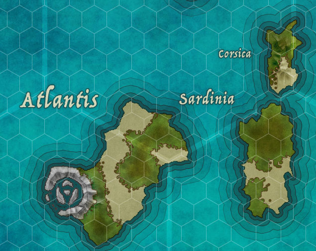
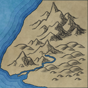
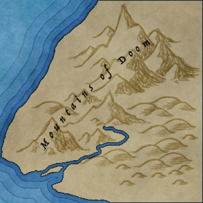
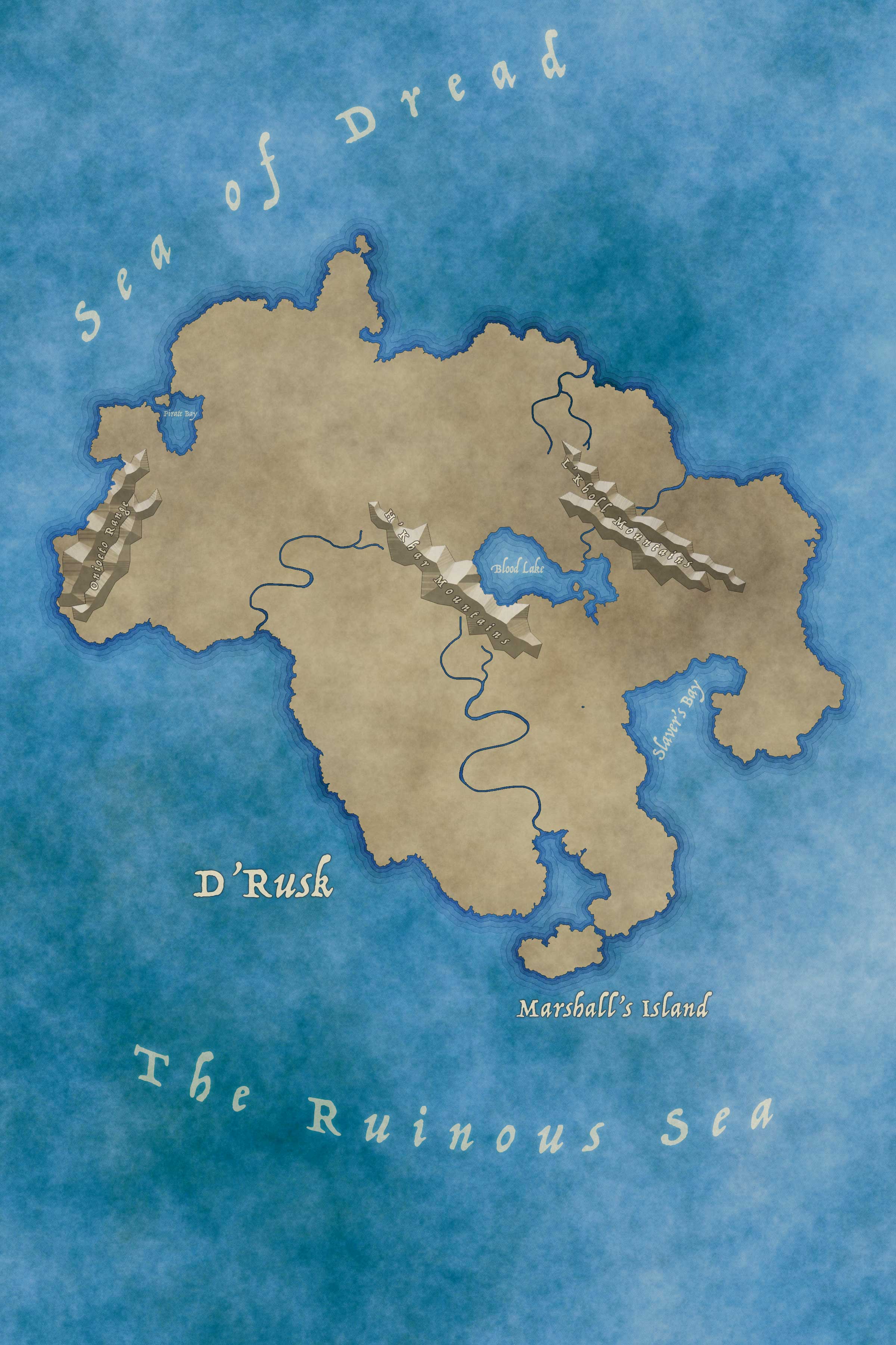
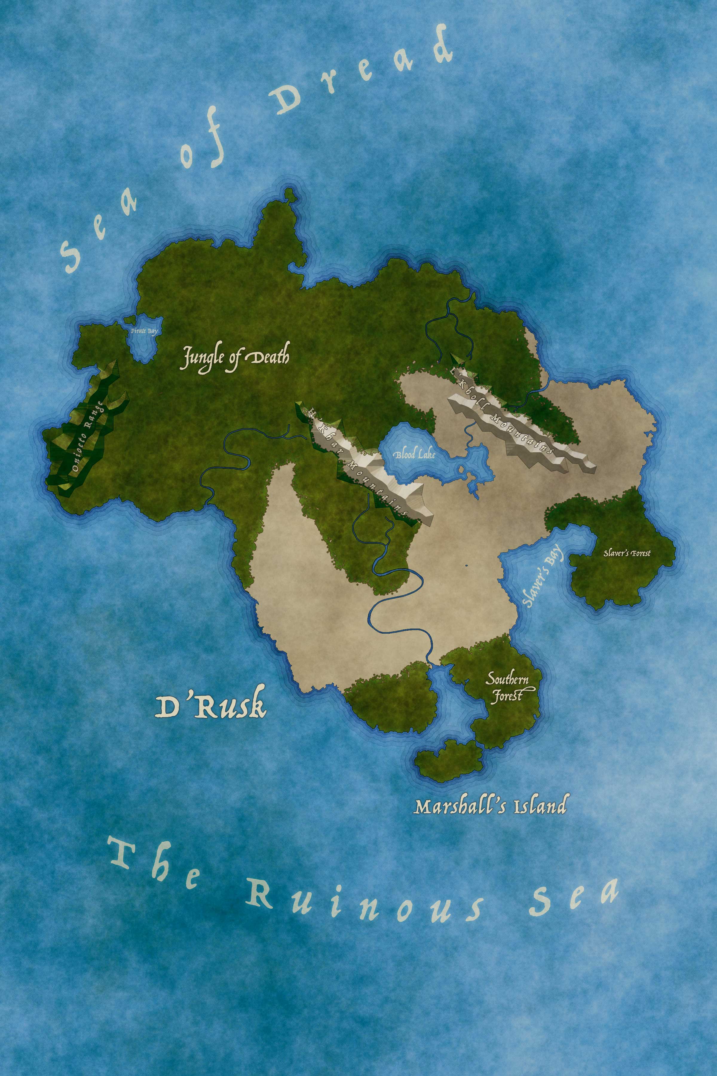
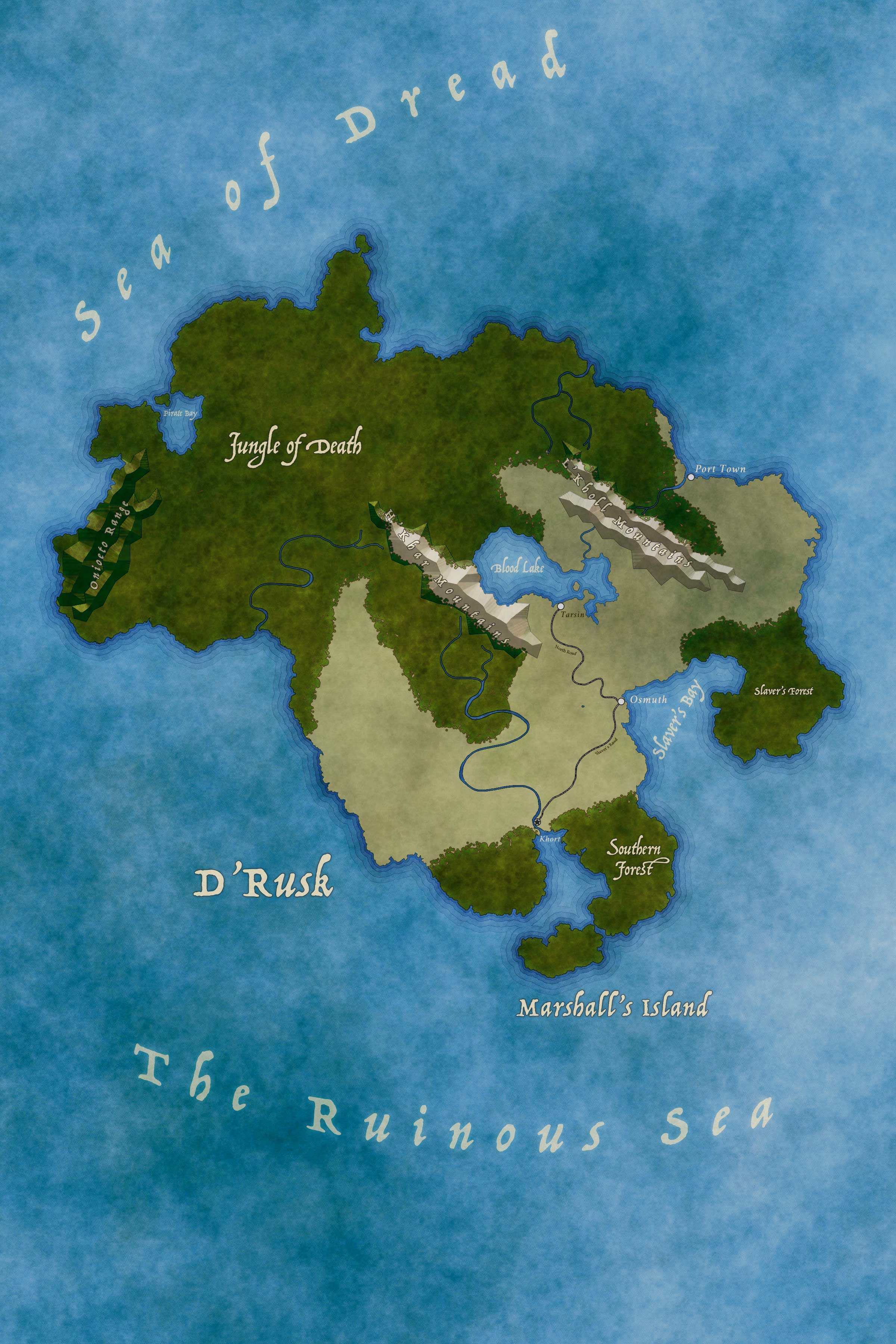
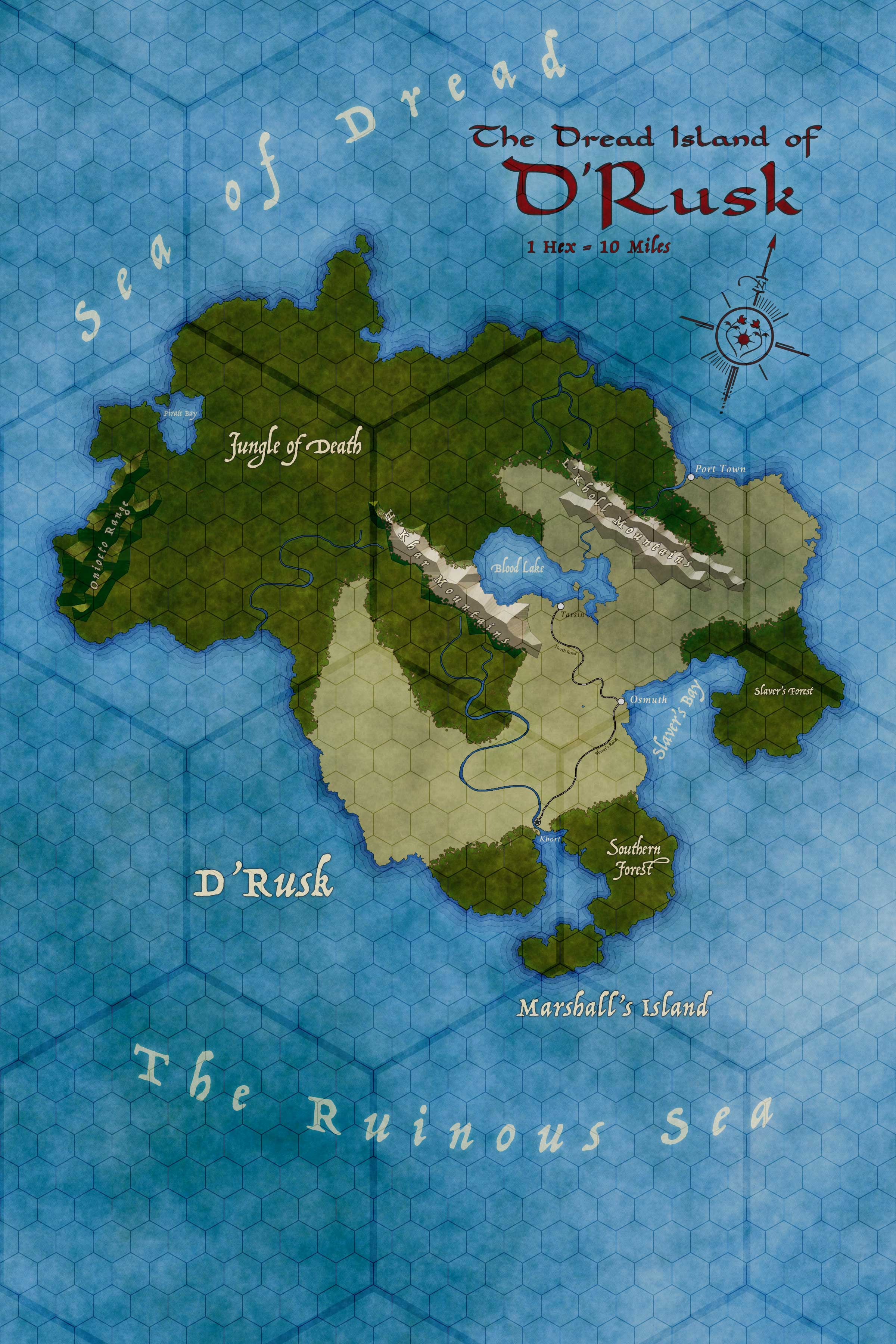
For this tutorial, I’ll be creating a small island map with a few mountains, rivers, forests, and towns. The process of creating an outdoor map for larger areas (regions, continents, or even the whole world) is the same, however. It probably won’t be a fully finished and fleshed map when done, but this is a tutorial, so what can you do?
Considerations
A Quick Note on Realism
Large-scale outdoor maps do not lend themselves to realism in any way. They are designed to convey information about vague geographical relationships and rarely if ever are intended to be used as the final word on a matter.
If the scale of your map says that 1 hex is equal to 10 miles, and the actual size of a hex on your map is 50 pixels, then a mile is 10 pixels wide. Most rivers are less than a quarter of a mile in width, so they might show up with an accurate scale (but appear very spidery). Roads (being roughly 30 feet wide) are simply too small to appear at that scale.
Further, it’s rarely possible (or desirable) for complete accuracy with regards to forests, mountain ranges, lakes, or rivers. You’ll have to make a lot of editorial decisions and accept a significant degree of vaguery. As your scale gets smaller, smaller objects can start appearing.
Note also the ephemeral nature of some things. Trees can be cut down. Villages can be burned. Nation borders change. Some things simply aren’t worth mapping.
Printing and Sizing Strategies
Make sure you’ve read the sections “On File Resolutions and Dimensions” in Fantasy Map Design Basics.
As a general guide, the larger the surface area you’re trying to show, the larger the map canvas should be. If you plan on printing your maps (and why would you not?), starting with a template canvas that matches the dimensions you are going to print at is a good idea. You can always scale down if you feel like working at the larger size is burdensome.
For this island, I’m going to size the map to 2400 by 3600 pixels at 300dpi. This will allow me to work with it easily but it will still look good when printed at a poster size.
Scaling Grid
Outdoor maps use hexagon for their Scaling Grids. Scale them accordingly, as described in Fantasy Map Design Basics. The larger the map, the more it will benefit from having two grids.
Label Organization
I highly recommend keeping your text labels in their own layer group. Place this group in the layer stack above all visual elements in the map – including your Scaling Grids.
I further recommend making sub-folders within: “Water”, “Settlements”, “Territories”, “Mountain Ranges”, “Forests”, etc. This way you can bulk-apply layer styles by just working on the folder.
Design Steps
- Create Base Water Layer
- Add Landmass
- Add Mountains
- Add Water
- Add Forests
- Add Verdancy
- Add Other Terrain
- Add Settlements
- Add Roads
- Add Title, Scale Marker, and Legend
- Finalization
Create Base Water Layer

First, you need a base “water” layer. There’s no point in having land without water, as it were. You just want something blue for now; you’ll style it later.
- Create a new layer at the bottom of your layer stack named “Water”.
- Set your paint color to a nice blue (
#0071b6 ). - Tap the Paint Bucket tool anywhere in the canvas.
Do this even if your landmass will cover the entire canvas. I have found that the best method does not add water (e.g., you’re drawing a blue river overtop your land), but removing land (you erase it to show the water beneath).
Add Landmass
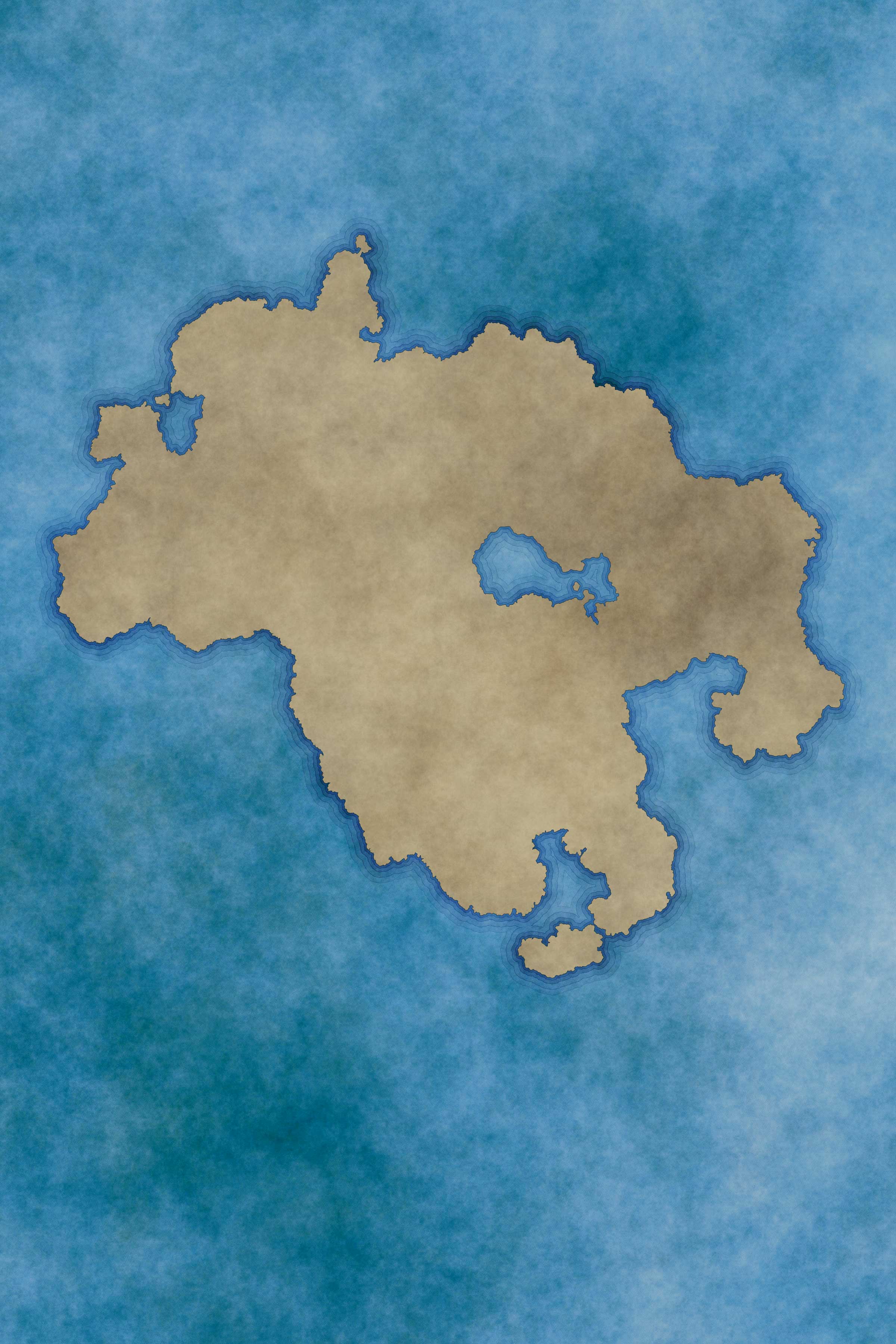
Once you have the Water layer, you will want to add the landmass. There are several ways to do this and each one has its benefits and drawbacks (for this tutorial, I’m going to use a randomly generated landmass).
You will find that you’re going to be constantly coming back to edit this layer. You’ll need to clean up a coastline, or move a river, or add an island. Thus, it’s good to allow for easy editing: which means pixels.
Making Landmass With Brushes
Starting from whole-cloth with brushes is can be daunting. Coastlines are randomly fractal and humans like to think in patterns and symmetry, so intentionally creating the chaos of a coastline is difficult.
I find that this is a sub-optimal method for mass generation, but the only acceptable method for continual editing.
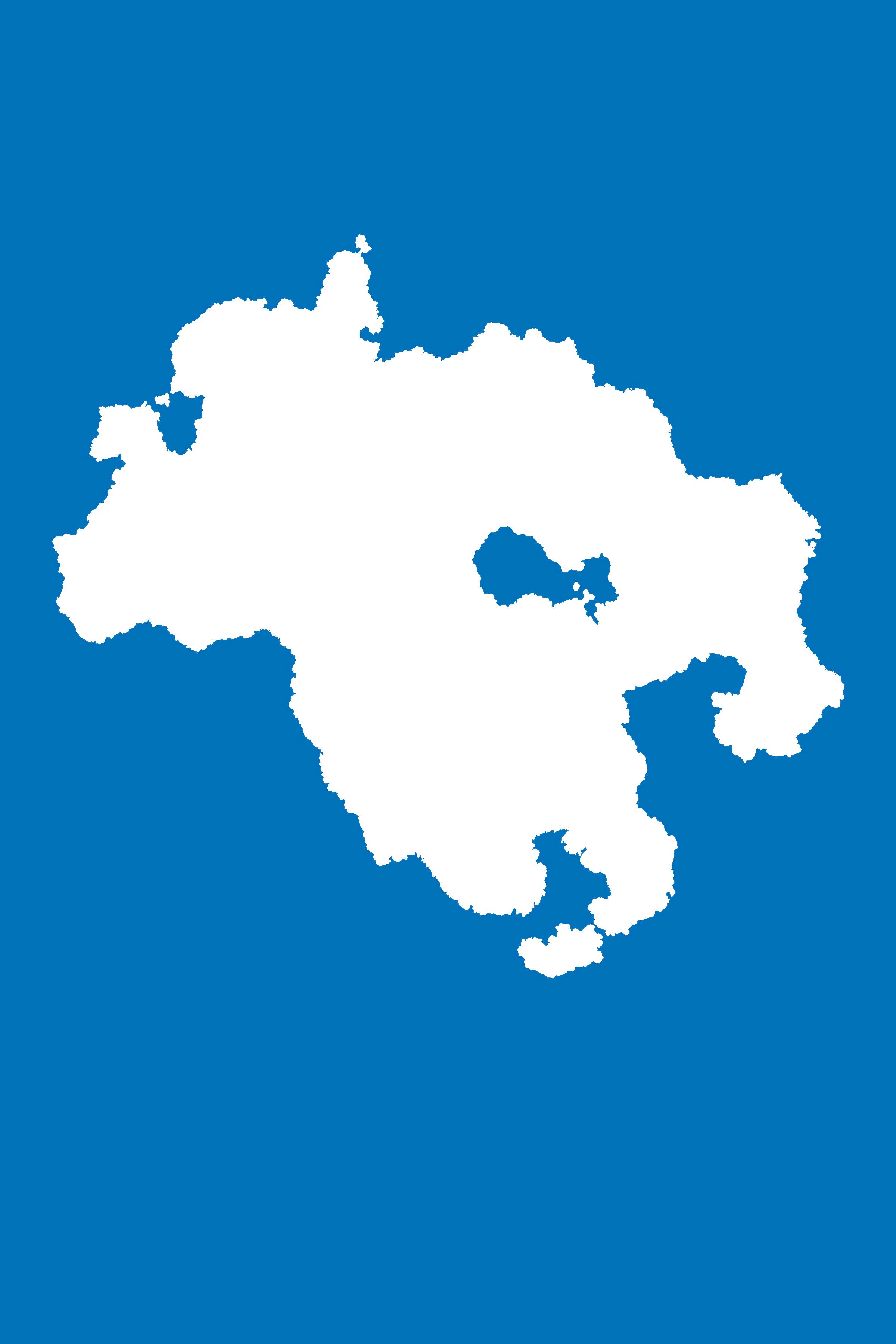
- Create a new layer above your Water layer, call it “Landmass”, and select it.
- Set your paint color to white (
#ffffff ) - Switch to the Brush tool. Select a Hard Round Brush, 100% opacity, and with a size that you can see and work with (you’ll need it to be larger on larger scale maps).
- Working in the Landmass layer, draw the coastlines of your landmass.
- When you’ve drawn the coastlines, fill in the rest of it using larger brushes. You can try to use the Paint Bucket tool but I suspect you won’t get the result you’re looking for (brushes aren’t pixel-perfect so you’ll either bleed the paint out everywhere or you’ll get an interior halo that you won’t like).
Bam! Landmass. Edit it to your heart’s content using the Brush and Eraser tools.
Making Landmass With Shapes
You can draw your landmass with the various shape tools – especially the Free-Form Pen tool. Doing so allows you to keep fidelity of shape if you ever resize the map, but at the sacrifice of detail and ease of manipulation. No matter how good you are at creating and working with shapes, it will not be as fast as working with a brush and an eraser.
Create your landmass layer (called “Landmass Shape”) as normal. Fill it with white (
(Note that you should absolutely work in shapes for everything when designing a Battlemap.)
I’m serious, though: Don’t do this. You will regret it almost instantly.
- Don’t.
Making Landmass via Random Generation
 Another way to create landmass is by random generation. This technique provides very realistic looking coastlines but can be labor-intensive. It is also worthy of it’s own sub-tutorial, entitled Randomly Generating Landmass, so go read that. I’ll wait.
Landmasses generated in this way are pixel layers and thus are edited using the Brush and Eraser tools.
We’re going to use a land-mass generated via this method for the rest of the tutorial.
Making Landmass via Tracing
If you want to make a map using an existing landmass as a template, tracing is the way to go. When I started designing Terracopia, I began with a map of Europe as my starting point. Maybe you want to create a mythical version of England and need your map to match its shape. Who knows? Either way, you’re starting from a template.
- Get a copy of the map you’re going to trace and cut and paste it into a new layer called “Template”.
- Resize the template to fit your canvas (using the Transform tool, or <command>t).
- Set the opacity of Template to between 30 and 50%. You want to be able to see through it.
- Create a new layer underneath the Template layer, call it “Landmass”, and select it.
- Set your paint color to white (
#ffffff ) - Switch to the Brush tool. Select a Hard Round Brush, 100% opacity, and with a size that you can see and work with (you’ll need it to be larger on larger scale maps).
- Working in the Landmass layer, trace the coast of the land as you can see in the Template.
- When you’ve traced the coastlines, fill in the rest of it using larger brushes. You can try to use the Paint Bucket tool but I suspect you won’t get the result you’re looking for (brushes aren’t pixel-perfect so you’ll either bleed the paint out everywhere or you’ll get an interior halo that you won’t like).
Ta-da! You’ve got a landmass to work with. Feel free to edit it (with the Brush and Eraser tools) as needed.
Cleaning Up Landmass
Now you need to go around and clean up the landmass. Now, depending on your Photoshop skills, you can mess around with Sharpness filters or try to do things by modifying selection sizes and the like, but I’m going to tell you to just skip to the end of that horrid process and break out a brush. You’re going to get here anyway; might as well start there.
We’re going to go around the entire map and redraw the edges. It’s tedious, but it makes it look great.
- Set your paint color to white (
#ffffff ) - Select your Landmass layer.
- Select the Brush tool. Make it a Hard Round brush, and size it so that it’s small but not too small (depending on the size of your document: 5 to 8 pixels is a good starting point), and set to 100% opacity.
- Zoom in close.
- Start drawing over-top the pixels along the edges of the existing landmass, covering up any “blur” or resizing halos.
- You can also use the Eraser tool as well.
- When you’re done, sharpen the edges. Go Filter -> Sharpen -> Sharpen to tighten up everything.
After you’ve run the sharpen filter, you may want to apply a dark 1 pixel stroke to the layer. Doing so will show you where things are wonky or don’t have full opacity. Spot edit those places.
In many places, this won’t do much. In others, it will do a hell of a lot. I absolutely recommend using a Pen Tablet for this because while it is possible to do this with a mouse, it will be hella tedious.
Coloring Landmass
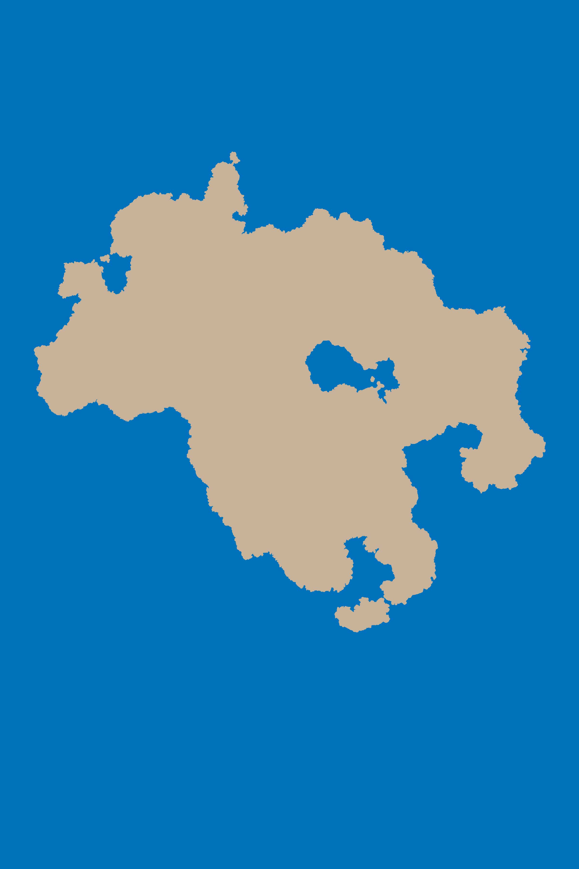
Right now, your land is pure white (
Just color the landmass entirely.
- Set your paint color to a good tan (I like
#c7b299 ). - Select your Landmass layer in the Layers tab as your working layer.
- Select all the pixels in the Landmass layer by holding the <command> key and clicking the preview icon for the Landmass layer.
- Hit the <delete> key to remove everything.
- Switch to the Paint Bucket tool.
- Click anywhere inside your landmass on the canvas.
Every pixel that was white should not be tan, with edge fidelity maintained.
Styling Landmass
Right now it’s just a big blob of tan. You’ll want to make it look like something. I find that the best way to start is by applying some simple style effects to make it pop. I’m going to go over these effects independently.
Stroke the Shorelines
You should always place at least one stroke on the shoreline, if only as a defininging separator. I like to have my shores extend outwards. In the example shown, there are a total of 9 strokes. Exactly none of them are set as “Overprint” (try it and see what happens).
- 1px, inside, normal, 70% opacity, color
#222222 - 5px, outside, overlay, 60% opacity, color
#222222 - 6px, outside, overlay, 100% opacity, color
#222222 - 15px, outside, overlay, 40% opacity, color
#222222 - 16px, outside, overlay, 90% opacity, color
#222222 - 30px, outside, overlay, 20% opacity, color
#222222 - 31px, outside, overlay, 70% opacity, color
#222222 - 45px, outside, overlay, 10% opacity, color
#222222 - 46px, outside, overlay, 40% opacity, color
#222222
Texture
I like my maps to feel like they were drawn on parchment. You may want a more realistic flavor. Again: it’s all about your personal style.
Pick a good, grungy texture and apply it as a pattern overlay on the Landmass layer. Play around with the blending mode and opacity for this to see what kinds of effects different textures produce. You may very well decide that “Normal” is the best way (and it often is, for certain patterns). The point here is to make it visually interesting beyond its outer shape. Adding texture does that.
If you want to use a parchment pattern, I would recommend finding a very large one that has lots of variant textures – ideally one that is bigger than your canvas. A great trick is to use the same pattern on your land and your water (using the same registration point) to create a more seamless visual experience.
Try that.
- Import this parchment texture into your pattern library (see Importing Your Own Patterns for how to do this).
- On your Landmass layer, set it as a pattern overlay, linked to layer, with a Normal blend mode, 100% scale, 100% opacity.
- On your Water layer, set the same texture as its pattern overlay, linked to layer, with a Hard Light blend mode, 100% scale, 100% opacity.
You can try other blend modes for the water layer! Some will make it darker, others lighter. You may want to change the color of your water layer, or apply some graident overlays to it. Experiment and play around with it. You’ll find that the way various blend modes interact with their base colors can change drastically.
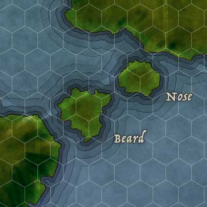
Labeling Landmass and Islands
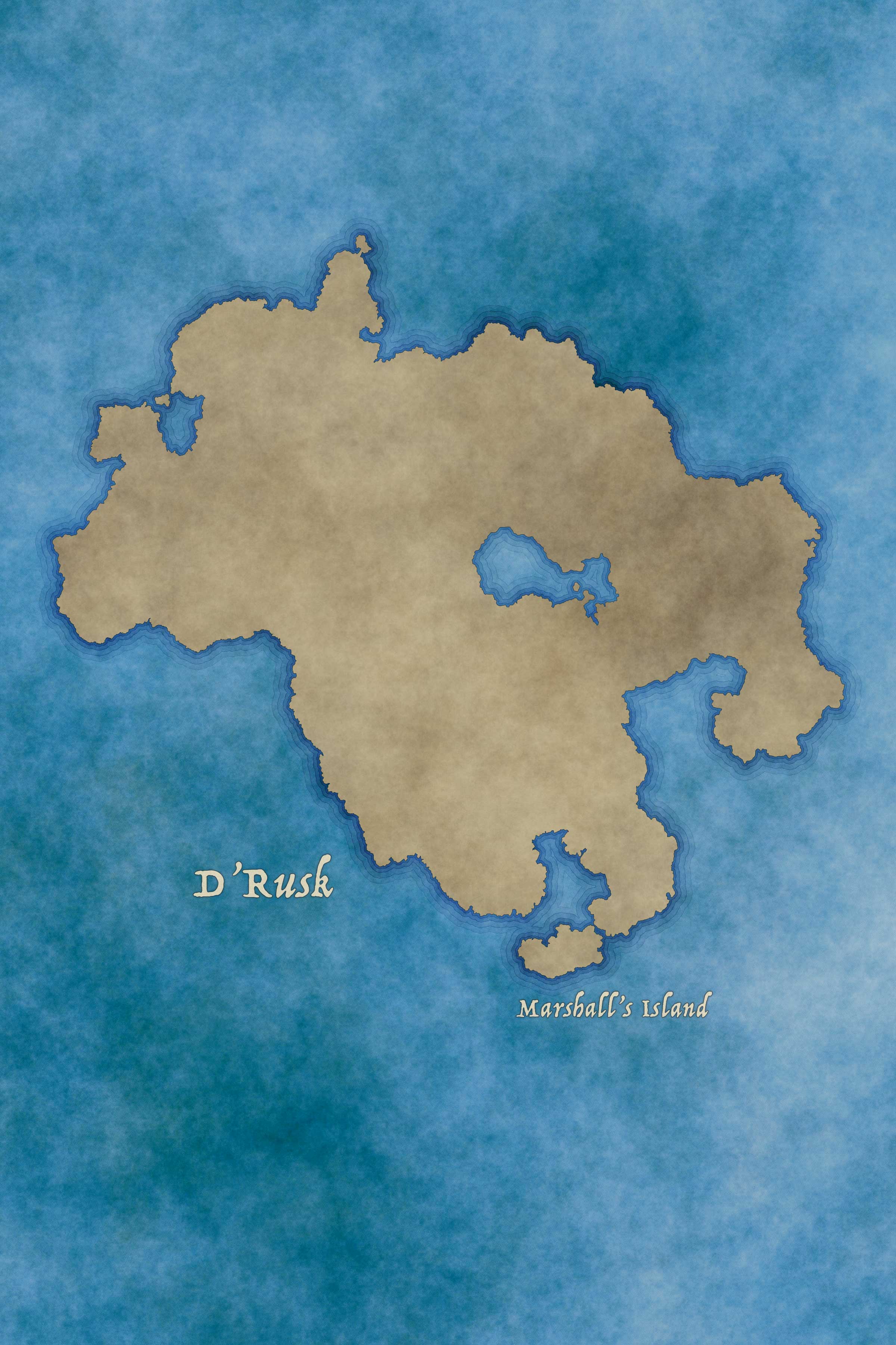
Landmasses and islands are a natural phenomenon. Pick your font accordingly (see Natural vs. Created Elements).
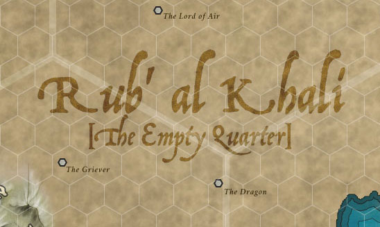
Labels for islands should be placed near the island they represent. The label should readable and straight and should be sized relative to the island’s size. The best thing to do is find the smallest size label you’re going to use and go upwards from there (otherwise you may find that your smallest labels are unreadable).
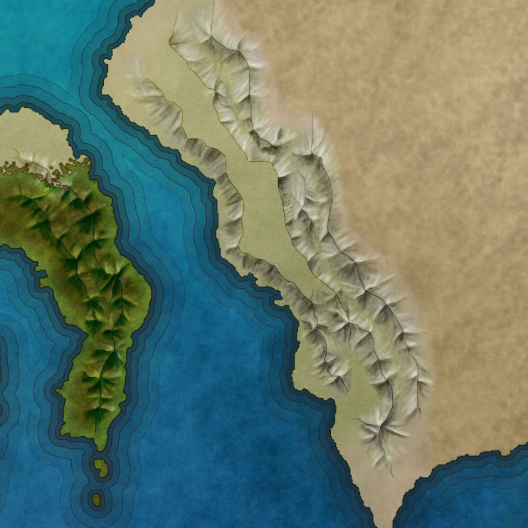
Add Mountains
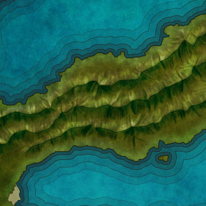
Once you’ve got the shape of your coastline, you have to figure out where the mountains are. Mountains (and hills) drive the location of everything else: rivers flow out of mountains to the coasts, and people live on the sides of rivers.
Landmasses – especially islands – are created with mountains. Islands are just the tops of mountains whose bases are at the bottom of the water. Mount Haleakala, on the island of Maui, is the tallest mountain in the world, if measured from its absolute base deep beneath the ocean. The large island of Gont in the Earthsea Stories is a single mountain.
Mountain Considerations
On Plate Tectonics
 Mountain ranges are created wherever two tectonic plates collide (plains are created where glaciers once slid). Looking at your landmass shape, think about where your mountains might be. Mountain ranges run more-or-less in a single direction. There may be spurs outwards, but for the most part they work in a line (the mountains around Mordor are an impossibility).
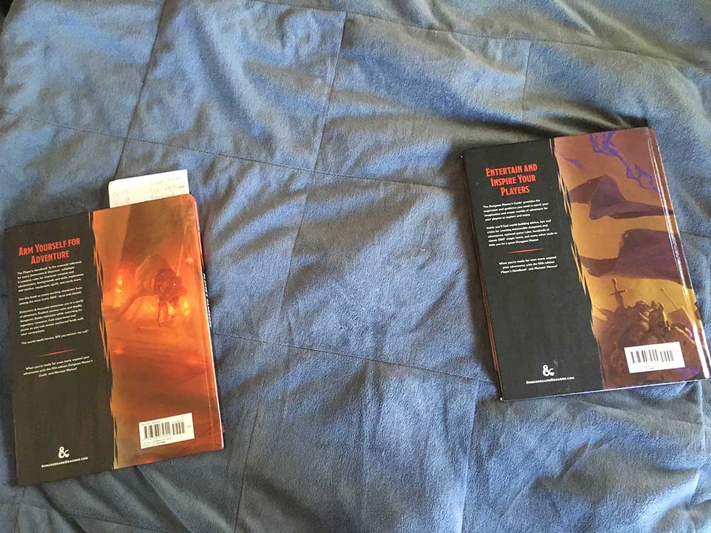
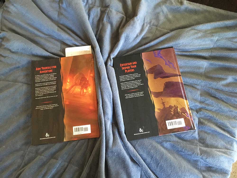
Here’s an illustration of how plate tectonics work:
Get a thick quilt and lay it out flat on the floor. Now get a couple of books. Your copies of the Dungeon Master’s Guide and the Player’s Handbook will work perfect. Set them both down on the quilt, about ten inches apart. Press down firmly on both – firm enough that the quilt will move with the book – and slowly push the books towards each other. You’ll notice that the quilt will start bunching up between them into folds. The folds will usually be straight.
This is how mountains are made: tectonic plates slide together and push the land between them into the air. Mountian ranges will only “bend” at sharp angles when more than two plates are intersecting.
On Mountain Ages
In geologic time, the younger a mountain range is, the taller and sharper its peaks will be. As Bilbo Baggins learned from Gollum, time “beats high mountain down,” so the oldest mountain ranges (like the Appalachians) are sometimes no more than foothills.
Rainfall, wind, and rivers wash away mountains over time through the process of erosion. This, too, is something you should think about when designing your mountain ranges. If your world has suffered a cataclysm within the memory of its inhabitants, the mountains created by the event will be new: tall, wide, and very pointy.
Determine Mountain Paths
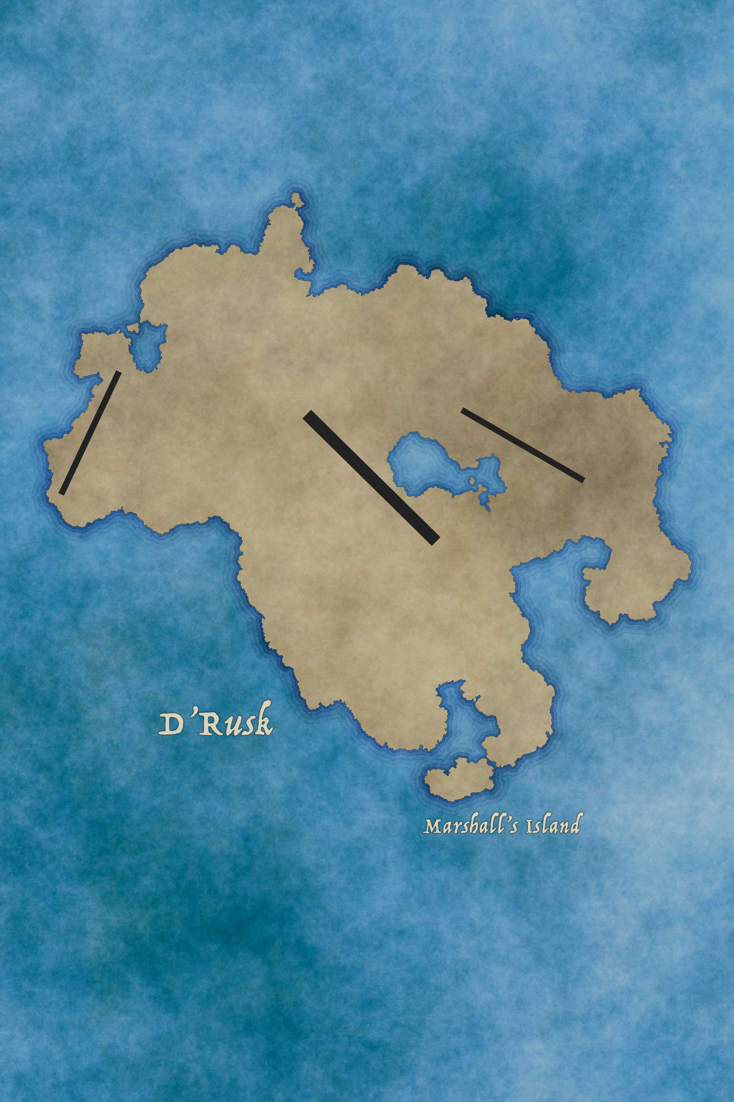
You want to lay down the areas where your mountain ranges run. This is basically a sketch of lines; you aren’t drawing the mountains yet. You want to have an idea of where the tectonic plates collided.
- Create a new layer above Landmass, call it “Mountain Sketch” and select it.
- Make a selection of the Landmass layer so you can only draw within its bounds (<command><click> on the Landmass layer’s preview icon)
- Set your paint color to black (
#000000 ) - Select the Brush tool, Hard Round, 100% opacity, with a large size (20+ pixels)
- On the canvas, pick the point where the mountain range will start and click it with the Brush.
- Holding the span class=”command”><shift> key, click the point where the mountain range will end. A straight line will draw between the points.
- (Note that if you want to freehand this, feel free)
- Repeat this process for each mountain range that is going to be displayed.
For larger mountain ranges, you may want to increase your brush size so that you have an idea of their relative size as you work.
You now have a rough map of your mountain ranges and the forces they exert. This is where you’re going to draw your mountains.
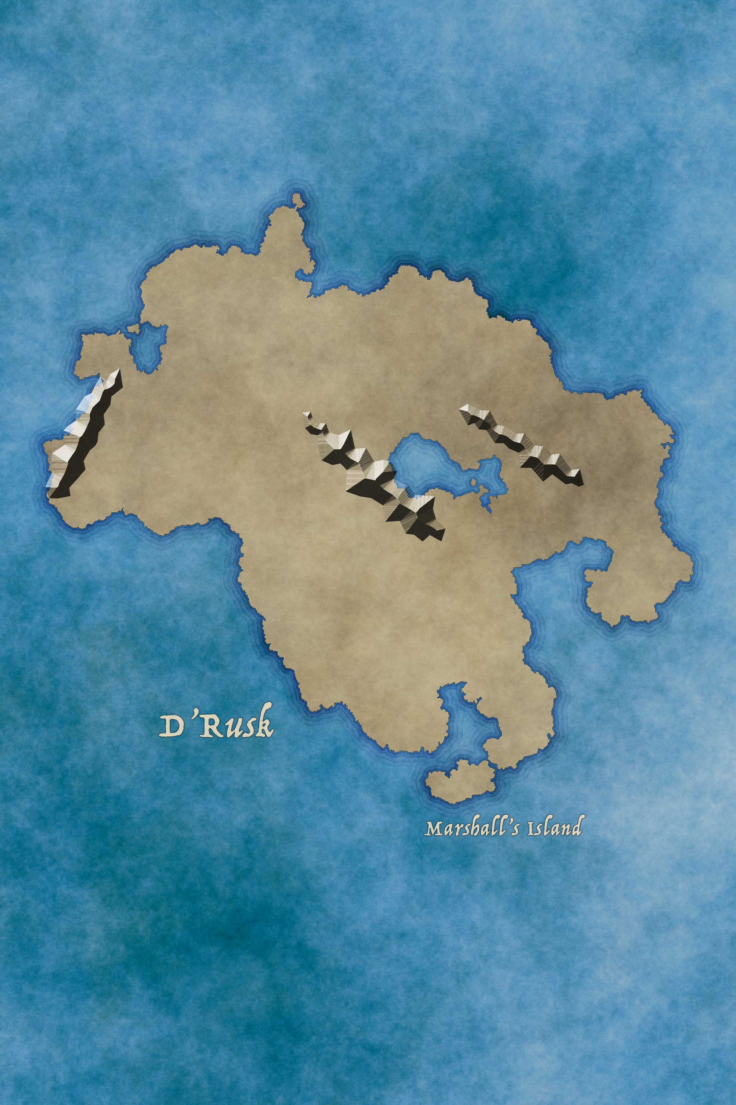
Drawing Mountains
 Drawing mountains is a big task that requires its own tutorial. Please jump out and read Creating Maps: Mountains before continuing.
Create a layer group called “Mountain Ranges” and place it above your Mountain Sketch. Draw your mountains in layers inside of the Mountain Ranges layer group.

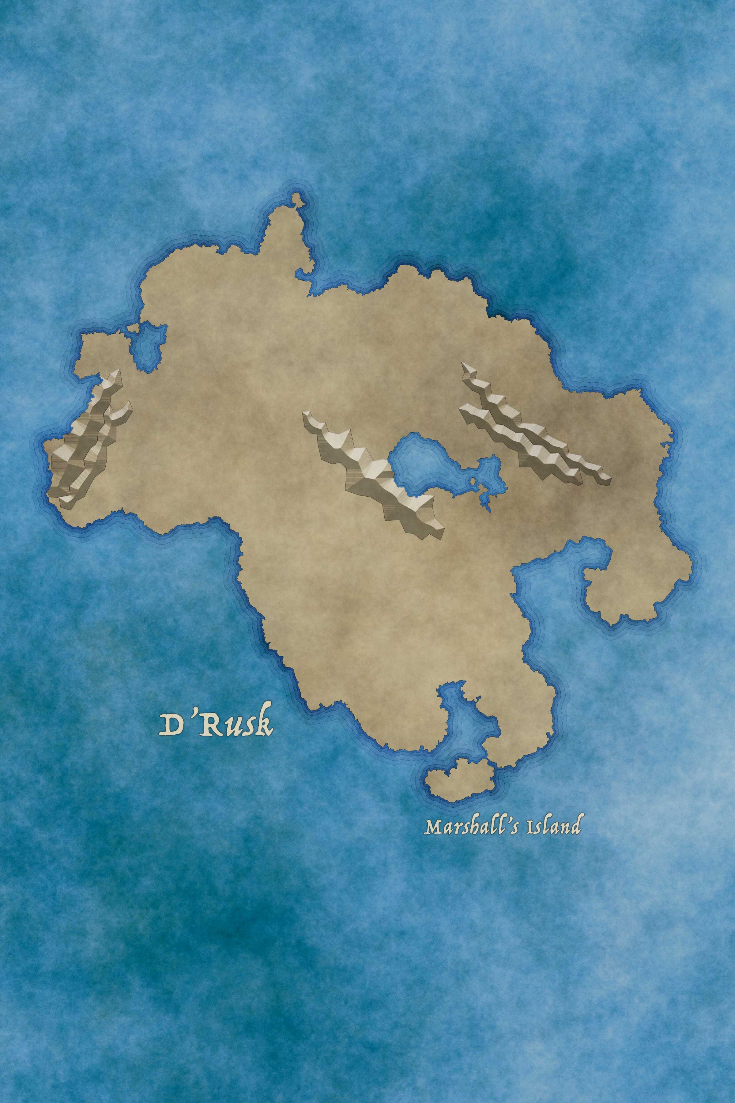

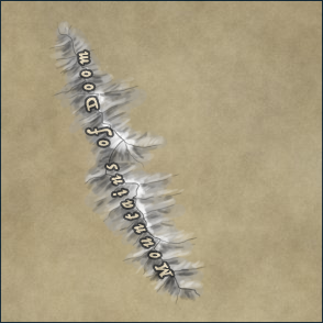
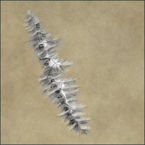
Labeling Mountains

Mountains and their ranges are a natural phenomenon. Pick your font accordingly (see Natural vs. Created Elements). Mountain ranges are labeled different from singular mountains.
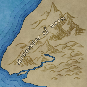
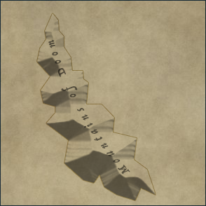
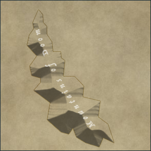
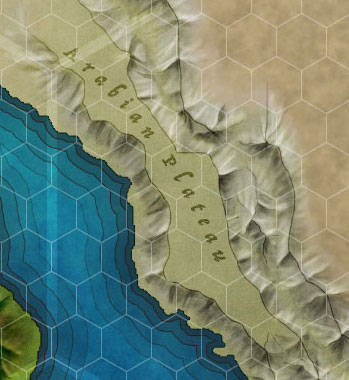
Labels for mountain ranges are drawn along the range. Use the Type tool options to spread the name of the range out and bend it to follow the range’s path.
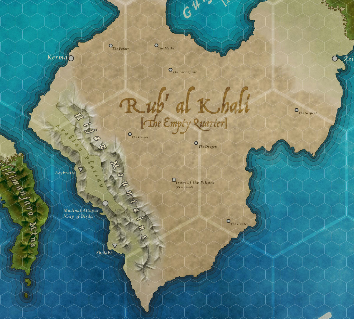
When calling out a specific mountain, use a triangle shaped icon (point up) placed at the mountain’s peak. This is the anchor for the mountain’s label, which should be below and to the left or right, depending on what else is there. Obviously, those positions may not work, but try to be consistent.
Labeling mountains is often tricky because depending on the way you’ve drawn them, they can be messy or detailed. You will want the labels to be readable. For ranges, I will typically pick a dark color for the font itself and give it a light stroke around the outside or center to draw it out. For peaks, I will stick with a solid color if I can, and add a stroke only when necessary.

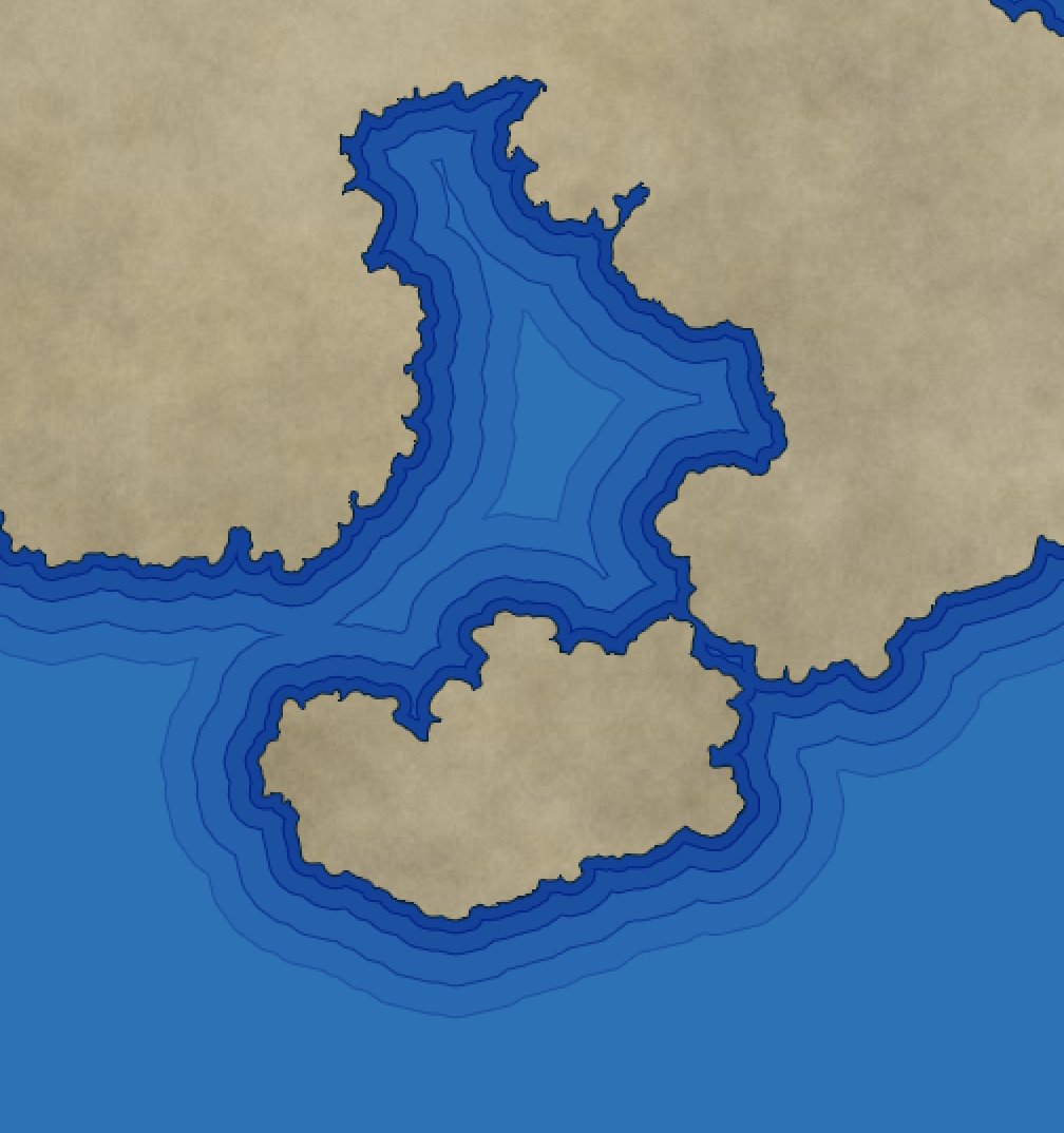
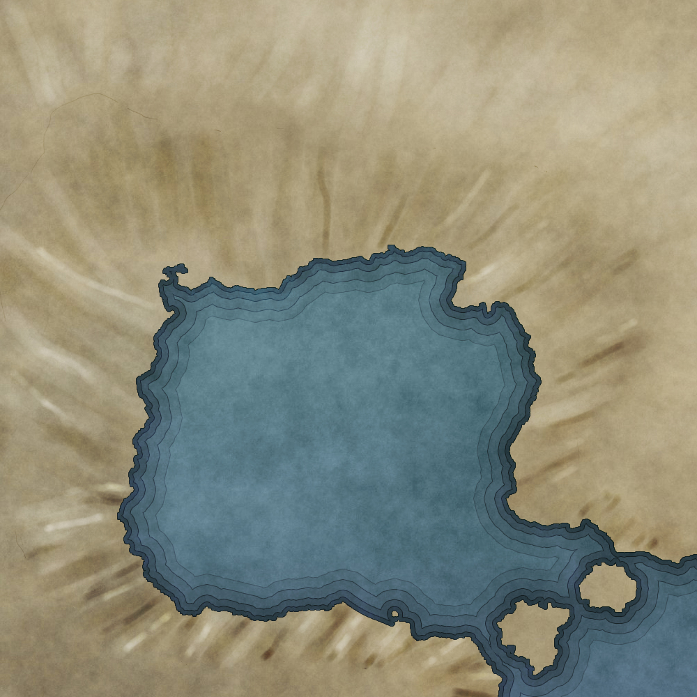
Add Water
When you’ve got the mountains in, it’s time to add water. Or, more precisely, it’s time to subtract the water from the landmass.
- Select your Landmass layer.
- Select the Eraser tool.
- Set your brush to Hard Round, 100% opacity, and a small size (3 – 5 pixels, depending on your resolution). Anything smaller than 3 pixels will be a problem and create halos. Don’t select any pressure sensitivity.
- Draw (err, erase) in the Landmass layer where the rivers and lakes are. Feel free to go over areas twice.
- Optionally switch to a larger brush size to handle thicker rivers.
- Optionally switch to a smaller brush size to draw in tributary rivers (in or around mountain areas)
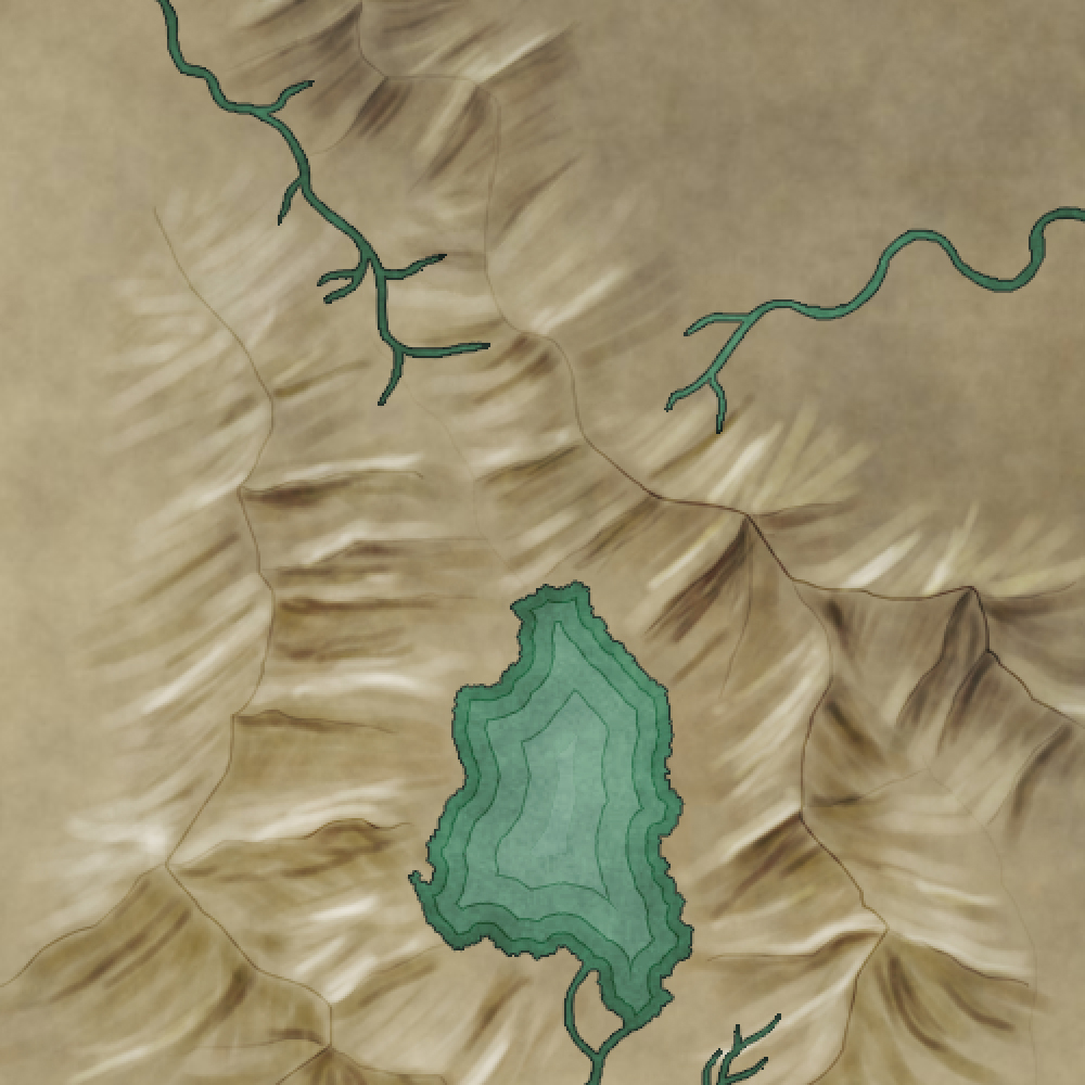
Rivers flow outwards from mountain ranges and either go to the seas or pool in lakes. When seen at a high enough scale, they rarely go in straight lines, instead meandering in S shapes around subtle (and not so subtle) hills. Only the mightiest of rivers (think the Mississippi, Amazon, or Nile) can overcome the forces of gravity to run in straight lines.
Rivers rarely split. They may flow around small islands from time to time but they do not fork very often. Small rivers and streams will join larger ones. Again, these always flow away from high ground, seeking the lowest ground possible. Further, they nearly always start as streams or smaller tributary rivers that start in mountainous regions (unless the source for the river or stream is a naturally occuring spring).
Take a look at where your mountains are. Does it look like there might be any lakes in the valleys they have created? If so, “add” them. You may need to edit your mountains to accomodate (e.g., move their edges, or erase parts that will overlap your lake – the method required depends on how you’ve drawn your mountains).
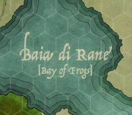
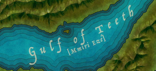
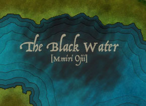
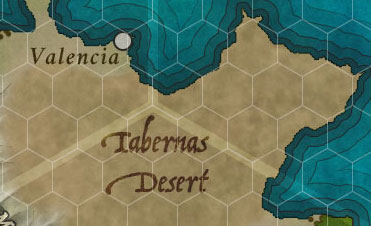
Labeling Water
Oceans, seas, rivers, lakes, and streams are a natural phenomenon. Pick your font accordingly (see Natural vs. Created Elements). Moving waters (rivers and streams) are labeled different from still waters (lakes).
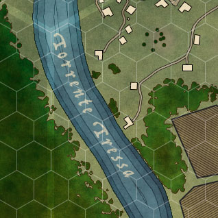
Labels for rivers and streams are drawn along the path of the river. Use the Type tool options to spread the name of the river out and bend it to follow the water’s path. The direction the text flows is important here as well as it indicates the direction of the river’s flow: the start of the text lies towards the river’s source and the end of the text should go towards the river’s mouth.
When two rivers join, they can form a new river (with its own name) or they will take the name of the larger of the two tributaries. For example, the Ohio river is a tributary of the great Mississippi river. The water of the Ohio ceases to be called the “Ohio River” once it merges with the Mississippi, which is a much larger waterway.
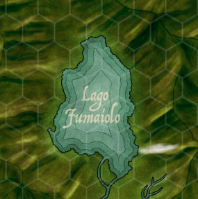
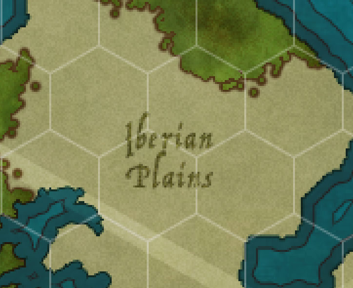
Labels for lakes are generally centered within the lake area itself.

Special water elements (like magnificent waterfalls) require an icon. I like three vertical lines. This is the anchor for the waterfall’s label, which should be below and to the left or right, depending on what else is there. Obviously, those positions may not work, but try to be consistent.
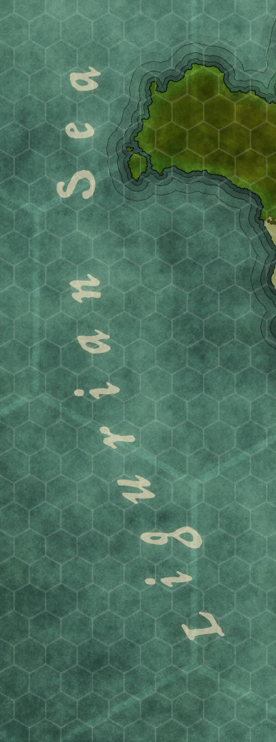
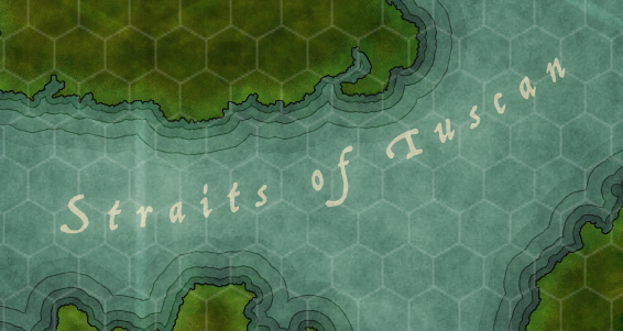
Seas and oceans are labeled similarly to mountain ranges. The text should spread out and the font size should be increased to serve as an indicator for the size of the body of water. Curve and rotate the text accordingly to fit the available area.
I have a preferred style for water labels.
- A color overlay of
#eadcbc set to a Color blend mode - An outer glow of
#eadcbc , Overlay blend mode, 0 spread, 20 pixel size - A pattern overlay of a simple noise pattern, set to Linear Light blend mode and 60% opacity
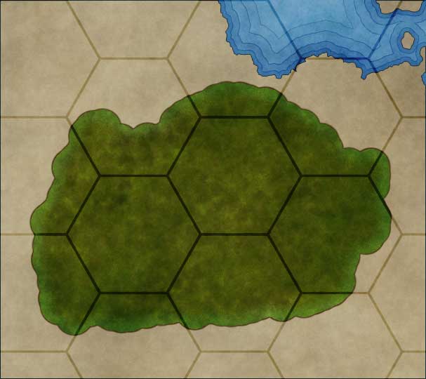
Add Forests
Depending on the style of your map, adding forests and other vegetation may or may not be important. For the sake of the tutorial, I’m going to assume that it is.

Forests show up where trees can grow. This usually means “not in deserts or tundra or plains”. The world is filled with trees of all kinds: huge swaths of land are covered in them. Most places are actually forests (even cities: take a look the next time you’re in a plane). Even plains have forests or orchards. That said, not every forest should be shown on your map.
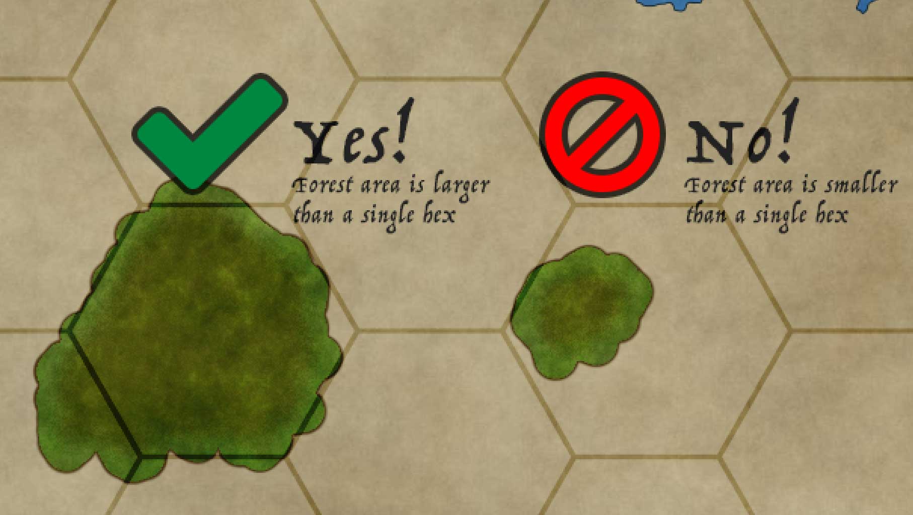
Add the forests that would be visible according to your scale. A general rule to follow is this: Only include a forest if it takes up more area than a full hex or space on your map.
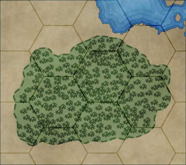
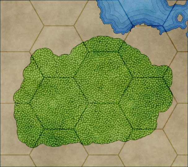
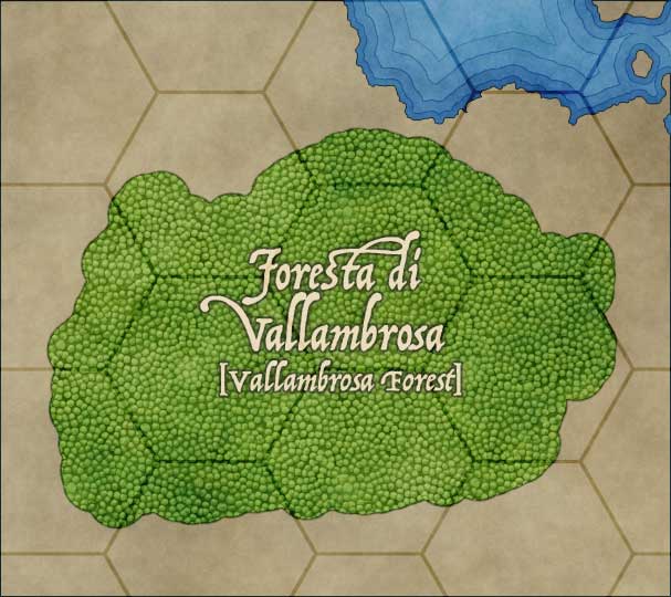
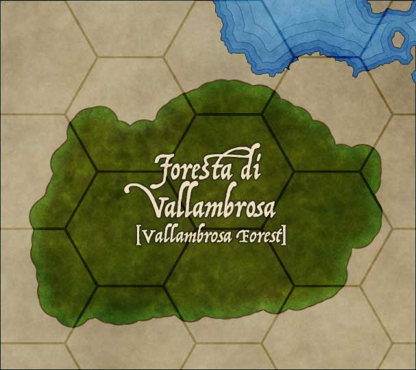
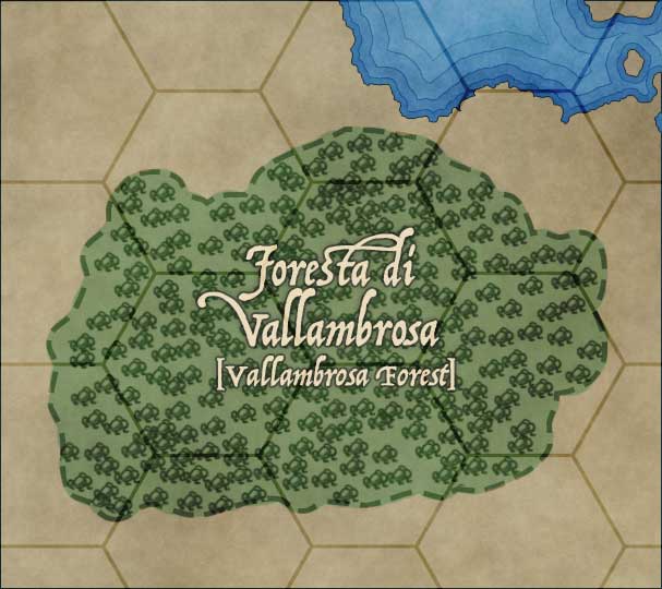
Drawing Forests
 Drawing forests is a big task that requires its own tutorial. Please jump out and read Creating Maps: Forests before continuing.
Labeling Forests
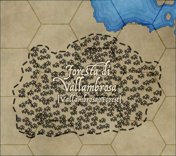
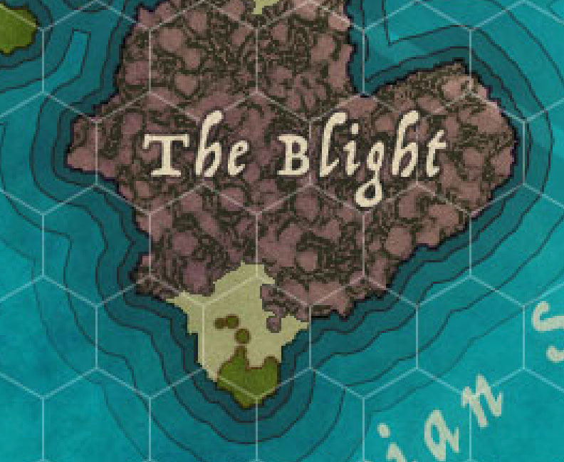
Forests are a natural phenomenon. Pick your font accordingly (see Natural vs. Created Elements). Labels for forests are centered and placed within the forest area itself. Depending on the font contrast, you may want to style them with a stroke or not.
Here are several examples of the same basic forest label style applied to multiple styles of forests. As you can see, it works better in some styles and not-so-great in others. Develop a label style that matches your map’s overall zeitgeist.
Add Verdancy

Verdant areas are places that have natural vegetation that isn’t a forest. Plains, grasslands – anywhere that isn’t a desert or too cold. You may or may not want to call them out – it’s your choice. Remember that everything on a map should serve a purpose. Verdant areas can only appear over landmass, so you’ll want to constrain them to the landmass itself.
You are going to paint verdancy in with the Brush tool.
You may ask yourself, “Self, why don’t I just select all the pixels in the Landmass area, fill it with a paintbucket, and then set the layer’s opacity to 20% or so?” and sure, you can do that, but you’ve now limited yourself to a maximum opacity of 20%, regardless of how thick or thin you want to make your verdant areas.
- Create a new layer above Landmass called “Verdancy” and select it.
- Set the fill opacity of the Verdancy layer to 30% and it’s blend mode to Overlay.
- Select all the pixels in the Landmass layer (<command><click> on the preview icon for Landmass). This will create a “cage” for our drawing.
- Set your paint color to your green color (
#005e20 ) - Select the Brush tool.
- Select a Hard Round brush of a large size (like, 100 pixels). Set its opacity to 20% or so. You can use an opacity sensitive brush but you may not like how that works out.
- Lightly paint in areas of verdancy. This can be sloppy.
- Go over areas multiple times for more verdant areas to increase its potency.
- Verdancy is heaviest around freshwater rivers and streams.
- Verdancy doesn’t go up into mountains much but it does cover hills.
- Use the Eraser tool to clear up mistakes.
You may want to play around with the fill opacity of the Verdancy layer when you’re done. I like to apply a pattern overlay as well (the Noise – Seamless pattern at 50% opacity with an Overlay blend mode) but you do you.
Wait! There’s more! Depending on the blend modes you set for your forests, they may be picking up the color bleed from your verdant areas and are looking kind of weird or possibly even mottled. I have a solution for you: deleting the forest shapes.
- Select the Verdancy layer as your working layer.
- Select all the pixels in the Forest layer (<command><click> on the preview icon for Forest).
- Hit the <delete> key. Abracadabra! It’s clean.
Remember this trick for clearing verdant areas. You’ll repeat it over and over again, with roads, settlement icons, mountains, and other things.
Labeling Verdancy
Most of the time you won’t be labeling verdant areas. The exception is when the area is a well known plain or plateau or something similar.
Verdancies are a natural phenomenon. Pick your font accordingly (see Natural vs. Created Elements)). Labels for verdances can centered and placed within the verdancy area itself or they can be stretched and contorted (like labels for mountain ranges or seas). Depending on the font contrast, you may want to style them with a stroke or not.
Add Other Terrain
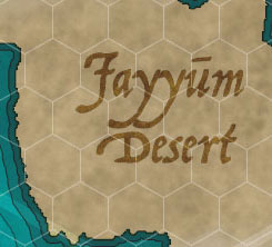
You will find that you may have additional terrain types that you need to call out, like deserts or tundra or badlands. These areas are drawn similarly to verdancy, but with a much higher opacity.
I’ll describe how to make a desert. The same technique works with all special terrain types; you just pick different patterns and effects in the end.
- Create a new layer above Landmass and call it “Desert”. Use a Normal blend mode for now (this will be ugly, but you’ll fix that.
- Select all the pixels in the Landmass layer (<command><click> on the preview icon for Landmass). This will create a “cage” for our drawing.
- Set your paint color to a good yellow. I use
#fff200 - Select the Brush tool.
- Choose a Hard Round Brush of a decent size (you’ll be painting a lot of area). Set to 100% opacity.
- Paint in the area of your desert. Don’t worry about the edges just yet; that’s next.
- Switch to the Eraser tool.
- Choose a Hard Round Bush of a much smaller size and set it’s opacity to 30%.
- Gently work along the edges of the desert where it meets other types of land (mountains, verdancy, etc.) Don’t worry about where the desert reaches the shore. Go over the edges multiple times to fade the yellow out, working inwards.
Now you’re going to want to add some styles to your desert because that looks janky.
- Set the fill opacity of your Desert layer to 0%.
- Set the blend mode of your Desert layer to Overlay (so background textures can bleed through).
- Apply layer effects as you see fit. I like to use:
- A brown
#8b6825 color overlay at 30% - A noise pattern overlay (I use “Grunge Noise – Seamless”) set to Multiply at 50%
- A brown
There are lots of good seamless sand and desert textures you can find and use, of course. As with all patterns, some are better at certain scales than others. You can also create your own “stamp” patterns (see “Bonus Take: Patterning with Tree Stamps” in Drawing Forests for an idea of how to do this).
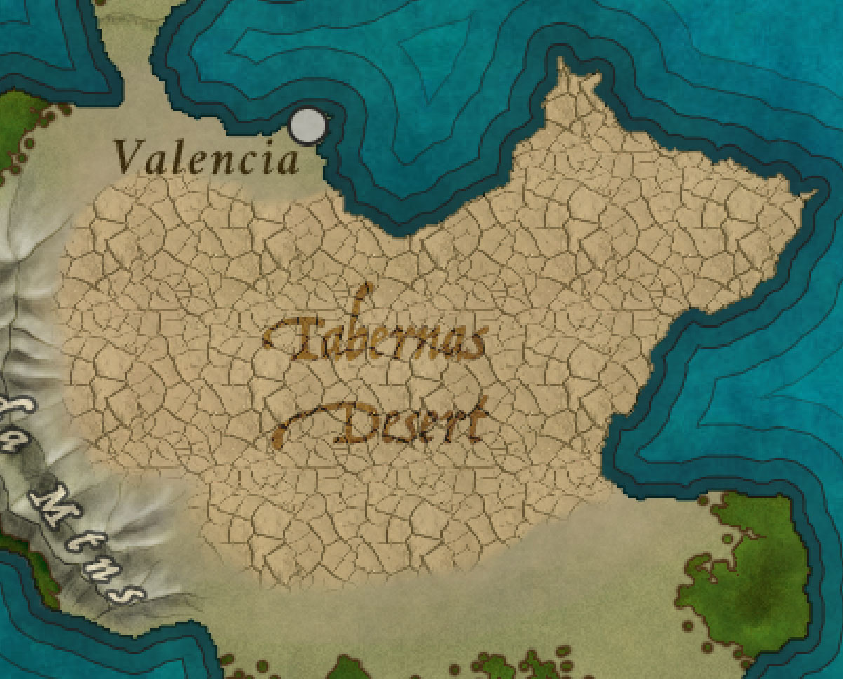
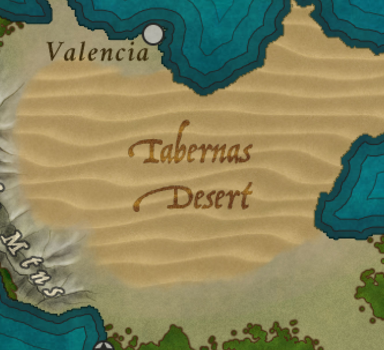
Labeling Other Terrain
Terrain types are a natural phenomenon. Pick your font accordingly (see Natural vs. Created Elements). Labels for these types can centered and placed within the area itself or they can be stretched and contorted (like labels for mountain ranges or seas). Depending on the font contrast, you may want to style them with a stroke or not.
Add Settlements

Settlements of any size need lots of things to survive, even in the most fantastic of worlds. The two most important things, however, are fresh water and a food supply. The absolute size of any settlement is going to be driven by the availability of these two things.
Water is the most important. The larger the population, the more water is required. It’s needed for drinking and for crops. It’s needed to power mills and transport goods.
Tiny villages (fewer than 50 people) can make due with a well to the groundwater. Small towns can survive with a few decent sized streams or a smallish river or fresh-water lake. Major cities (those with a population of 2000 or more) will need to be located on a large river or a large fresh-water lake – streams and wells will not cut it for that many people.
You can’t realistically plop a city of 7,000 people anywhere. It has to make sense.
Port cities will be near shipping lanes – usually on the outside edges, rather than inside deep or large bays.
Settlement Type Icons
Settlements need icons to show that they exist. Most often this is done with filled or styled circles. Region or nation capitols will often contain a star shape. This is the most simple way to handle this.
You can give each settlement a different icon depending on its basic type or size with a different icon treatment. I recommend placing these icons within a circle, however.
Some settlement types that might be distinguished using thier own icons:
- Capitol Cities
- Ports
- Small Villages
- Large Villages
- Walled Cities
- Mining Towns
- Lumber Towns
- Farming Villages
- Pirate Havens
- Ruins
- Other Points of Interest (temples, etc.)
Of course, you can always get fancy and give each city its own icon that represents it (a crest, perhaps) or even mark settlement locations with flags or other icons.
For each settlement icon, I highly recommend turning them into Smart Objects (see “Smart Objects” in Photoshop Basics for how to do this). Doing so will reduce your overall CPU usage and you’ll be able to make mass-edits easily.
Keep all your settlement icons in their own layer group called “Settlements”. Name each icon the same as its label. I recommend adding further groups as needed. For instance, if you have a lot of islands with a lot of towns, group them by island or perhaps by nation or state.
Make sure to keep a copy of each icon type if you want to include them in your Legend Key (see “Legends” in Fantasy Map Design Basics).
Labeling Settlements

Settlements are a created phenomenon. Pick your font accordingly (see Natural vs. Created Elements).
The placement of settlement labels should follow these rules:
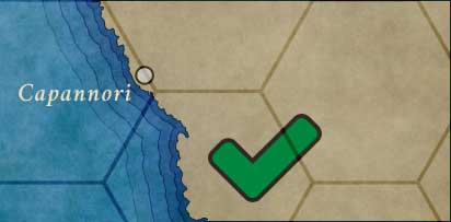
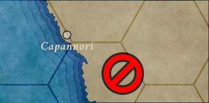
- Settlement labels should never cross a shoreline, river, or boundary line.
- If the boundary is to the left of the settlement, the label goes on the right.
- If the boundary is to the right of the settlement, the label goes on the left.
- Settlement labels should most always be horizontal. Never curve a settlement name.
- An exception is for highly detailed, zoomed maps where labels can be placed at angles if the situation requires it.
- For settlements inside the land, the label should be placed in the following order, given available space:
- Top right, left aligned
- Right, left aligned
- Top left, left aligned
- Bottom left, left aligned
- Bottom left, right aligned
- Left, right aligned
- For coastline settlements, the label should be located in the water, and to the top or bottom corner as makes sense given the coastline.
Add Roads

If your map is at a scale where roads would be visible, you’ll need to add them. This will be done with the Brush tool. I recommend using a pen tablet for this.
- Create a new layer above Landmass and call it “Roads”.
- Set your ink color to anything you like. I recommend a brown (
#754c24 ) - Select the Brush tool. Use a Hard Round brush, 100% opacity, and sized accordingly (probably very small: 2 to 5 pixels maximum – use your best judgement).
- On the Roads layer, draw lines between your settlements where the roads go. These won’t be straight. Roads meander much like rivers do, and (because humans are lazy) tend to go between or around hills and mountains rather than over them
You may find that you can’t see your roads because they are obscured by other elements, such as forests or verdancy. The solution here is to delete the road’s shape from those layers (this is why I said to keep a “full” copy of each of your vegetation layers).
- Select that layer as your active layer in the Layers panel
- <command> click on the preview icon on the Roads layer to select all of its pixels
- Hit the <delete> key. The road is now visible.
You’ll want to style your roads. I like to use a dark stroke (1 px inside,
Roads that cross water will likely have bridges. You can draw a bridge and put it beneath the Roads layer if you like.
Labeling Roads
Roads are a created phenomenon. Pick your font accordingly (see Natural vs. Created Elements).
Like rivers, labels for roads are drawn along their paths. Use the Type tool options to spread the name of the road out and bend it to follow the roads’s path. There is no special information imparted by the direction of text with a road label (roads go both ways).
Roads are often labeled multiple times along their paths. When roads converge, they typically take the name of the larger, longer road in much the same way that rivers do.
Add Title, Scale Marker, and Legend
Make sure to add your title, scale marker, and legend as described in Fantasy Map Design Basics.
Finalization
There isn’t a lot of finalization to be done with outdoors maps. Mostly you will need to ensure that your layers are stacked correctly and that your scaling grid has the right type of effects, overlays, and transparencies to be pretty while still visible and not overpowering.
When you’re done, you’re on to Printing Maps.
Comments on Designing Fantasy Outdoors Maps
This is not at all what I was searching for, however I was intrigued & ended up reading the entire post. Well written and a great attention to detail with good descriptions of technique. I’m labeling a premade web based map, but I still found some useful tidbits and possibly ideas for a future world/map.
Hi, I’m having trouble following the stroke shorelines step. Is this just edit->stroke and then those settings? Or is it some other step. Using the former, I don’t get the same appearance you do. Also, doing it on the land-mass layer makes the pattern overlay appear on those strokes. Sorry if this is a nonsense question :/
How do you place one stroke on the shoreline?